

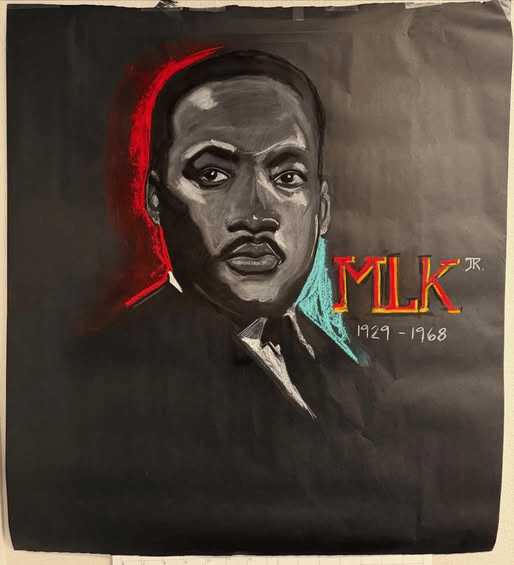
Recently, I created a 36” x 36” chalk portrait of Martin Luther King Jr. for our school’s Black History Month program. The entire piece took about ninety minutes from first mark to final edge.
What surprised me most wasn’t the speed.
It was the comfort.
A few years ago, I couldn’t have worked this loosely. I would have tightened too soon. I would have chased details before structure. I would have tried to prove something with the rendering.
This time, I didn’t.
Starting with Mass, Not Detail
Working at 36 inches forces you to think differently. You can’t hide behind small strokes. You have to draw from the shoulder. You have to commit.
I began with large value shapes — blocking in the dark field and carving the light from it. The face emerged from the black rather than sitting on top of the paper.
Edges were left soft until the end. Only after the structure felt solid did I refine a few transitions: the cheek plane, the brow, the lower lip. Selective clarity creates authority. Overworking kills it.
That restraint is something I’ve had to learn intentionally.
When the Piece “Asks” for More
I hadn’t planned to add color around the portrait. Originally, it was meant to remain stark — white chalk against black paper.
But as I stepped back, the composition felt incomplete. It needed temperature contrast. The red on one side and the cool blue on the other were added quickly, instinctively.
There wasn’t much analysis in that moment.
Just trust.
And that instinct only comes after years of studying value, balance, and design. What once required careful calculation now happens more naturally.
Looseness Isn’t Lack of Control
There’s a misconception that tight rendering equals skill. Early in my development, I leaned heavily into detail. It felt safe. It felt like proof.
But looseness, when grounded in structure, carries more life.
The underlying gesture remains visible. The drawing breathes. The viewer completes what isn’t over-defined.
As an illustrator — particularly in children’s publishing — that balance matters. Narrative images require clarity, but they also require energy. The goal isn’t maximum detail. It’s hierarchy of detail.
Large shapes first.
Selective refinement second.
Stop before you suffocate the drawing.
Teaching Through Example
My students will see this portrait hanging in the hallway. Whether they realize it or not, they’re also seeing process.
They’re seeing bold strokes.
They’re seeing restraint.
They’re seeing that not every surface has to be polished to perfection.
Sometimes growth looks like doing less — and trusting it.
The Larger Lesson
This portrait wasn’t about speed. It wasn’t about spectacle.
It was about realizing that I no longer feel the need to prove every ounce of skill in every piece.
Structure holds.
Instinct guides.
Restraint strengthens.
Looseness, when earned, becomes confidence.
And that may be the most valuable lesson the drawing offered me
M. Chad Randall is a published children’s book illustrator known for his gentle, emotionally resonant artwork. He is available for partnerships with writers, publishers, and editors who value timeless, story-driven illustration. He’d love to bring your next project to life. Contact HERE.
Recent Comments